Role: Head of Product Design, Research and Service Design
Company: Omnipresent
Initiative: Design System Refresh for platform consistency, accessibility, developer velocity, brand alignment
The Challenge
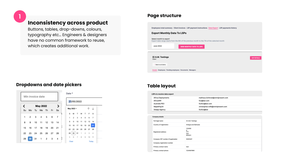
When I joined Omnipresent in early 2022, the platform—OmniPlatform 1.0—was built largely by engineers across independent squads, with little shared design guidance. UI patterns varied wildly, brand alignment was inconsistent, and accessibility had not been prioritised. There was no centralised component library, and design debt was accumulating fast.
This inconsistency created a cascade of issues:
* Engineers duplicated UI components across teams
* Design work was often reinvented instead of reused
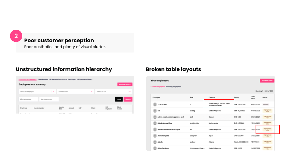
* The customer experience lacked polish and predictability
* Internal stakeholders (Sales, CS) reported embarrassment when demoing the product
* Design work was often reinvented instead of reused
* The customer experience lacked polish and predictability
* Internal stakeholders (Sales, CS) reported embarrassment when demoing the product
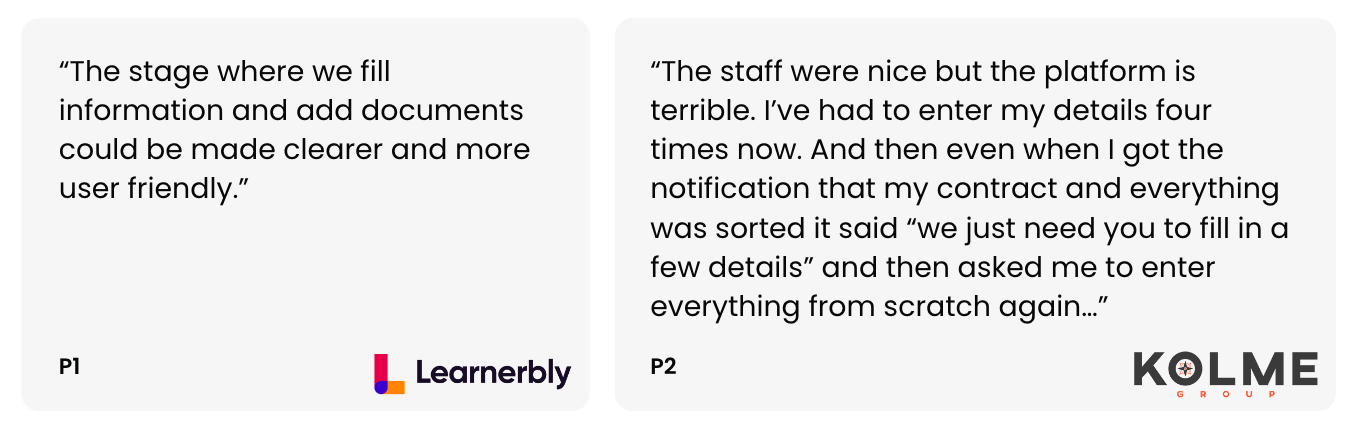
“Our visual design is holding us back. We’re losing credibility when we show the product.”
— Sales team member, during internal feedback sessions
— Sales team member, during internal feedback sessions
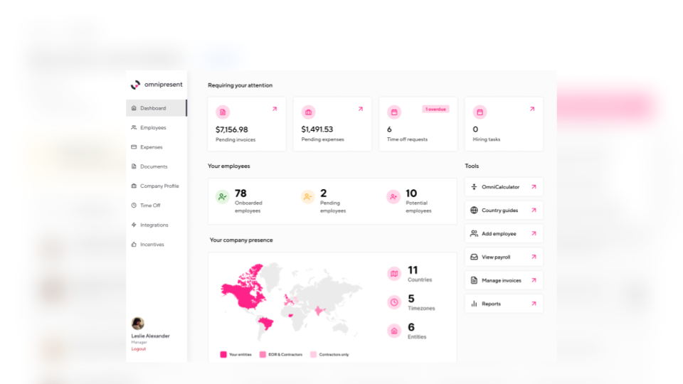
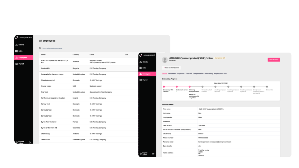
The Past State OmniPlatform 1.0 (existing until Nov 2022)
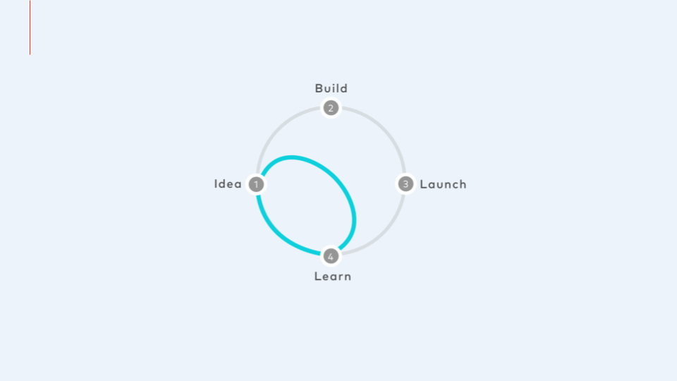
The Approach
To solve this, I led a phased strategy to design, launch, and scale a design system rooted in real business needs. My approach included:
* Design Hiring: Advocated for and onboarded a dedicated Design Systems expert to own the initiative
* Cross-platform audit: Facilitated a full audit across the platform to identify UI inconsistencies, performance issues, and visual design breakdowns
* Executive alignment: Secured buy-in from Engineering, Marketing, and Product leadership by connecting the design system to business outcomes (developer velocity, brand perception, customer trust)
* Accessibility-first: Committed to WCAG 2.0 Level AA compliance from day one
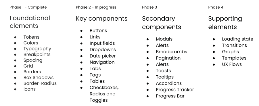
* Phased rollout: Introduced the system in stages to minimise disruption and allow for validation and iteration
* Cross-platform audit: Facilitated a full audit across the platform to identify UI inconsistencies, performance issues, and visual design breakdowns
* Executive alignment: Secured buy-in from Engineering, Marketing, and Product leadership by connecting the design system to business outcomes (developer velocity, brand perception, customer trust)
* Accessibility-first: Committed to WCAG 2.0 Level AA compliance from day one
* Phased rollout: Introduced the system in stages to minimise disruption and allow for validation and iteration
The Solution
In November 2022, we launched Omnipresent Design System 2.0—a flexible, accessible, and scalable system tailored to our platform, brand, and user base.
Key components included:
* Design Tokens & Component Library: Built in Figma and implemented in code, enabling fast reuse
* Revised Colour Palette & Typography: Aligned with accessibility guidelines and updated branding
* Structured Documentation & Guidelines: Accessible across teams for quick onboarding and consistent implementation
* Integration with Engineering Workflows: Collaborated with frontend engineers to ensure components were usable, tested, and version-controlled
We also delivered internal training and launched a playbook to support adoption, critique rituals, and contribution standards.

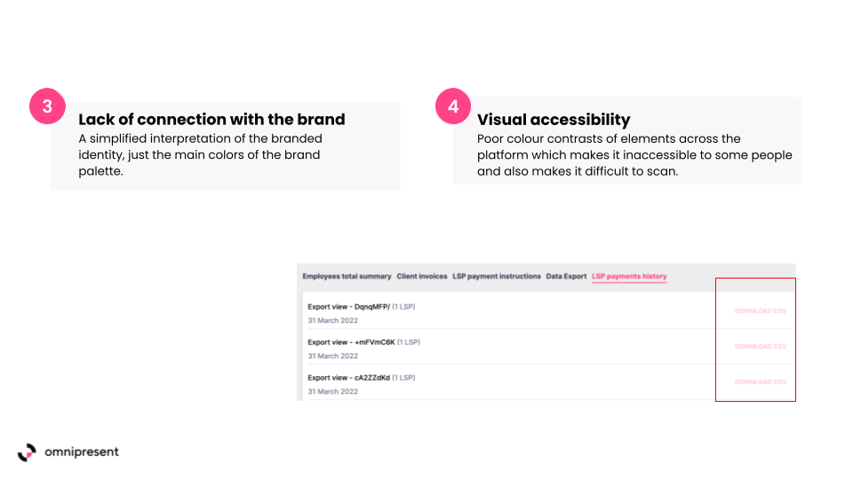
Accessibility - Revised colour palette and contrast now meets Web Content Accessibility Guidelines (WCAG) 2 Level AA. Typography adheres to the same guidelines for size and colour usage.

The Impact
The design system quickly demonstrated measurable results across multiple areas:
* Developer velocity increased by 20%, as engineers began using reusable components and consistent UI patterns, significantly reducing build time.
* UI-related support tickets dropped by 18% between Q1 and Q3 2022, indicating a more intuitive and reliable user experience.
* Accessibility across core user flows reached 100% compliance with WCAG 2.0 Level AA, improving inclusivity and aligning with global accessibility standards.
* Internal stakeholder confidence in design quality rose from 3.7 to 4.5, based on average scores in quarterly product satisfaction surveys.
* Within 8 weeks of launch, more than 65 components were adopted across all squads, showing strong uptake and integration into team workflows.
“For the first time, it feels like our product speaks with one voice.”
— Tech Lead, Platform Engineering
— Tech Lead, Platform Engineering
“This isn’t just a visual update. It’s raised the bar for what we ship.”
— Head of Product
— Head of Product
In Summary
The Design System Refresh laid the foundation for a unified product experience, stronger brand expression, and faster, more confident execution across teams. It shifted design from a bottleneck to a business enabler—embedding accessibility, reuse, and strategic alignment into how Omnipresent builds for the future.
Beyond that, we used this momentum to explore what comes next. Building on insights from the design team, customer feedback, and product research, we co-created and visualised a set of proposed new features and design directions. This future vision became a powerful alignment tool—helping stakeholders imagine what a more intuitive, efficient, and delightful Omnipresent platform could look like, and sparking new conversations around innovation and roadmap priorities.